 UCLA's 2006 poster schedule has balance, is easy on the eyes and earns the seal of approval, but it lacks attention to detail and falls short of several other entries. Now how could this piece have been improved? Our main complaint is with the ugly typeface across the top proclaiming "2006 UCLA Football." It's wasted space and shows a lack of creativity. Something is needed here to punch it up and add pizazz. But hey, you be the judge. What do you think? Compare it to other poster schedules we have displayed: Ohio State, Mississippi State, Auburn, South Carolina, Arkansas, Florida State, Florida, Iowa State and USC. If you have an image or link to your team's 2006 poster schedule, send it our way. The address is dawizofodds (at) aol.com.
Thursday, August 10, 2006
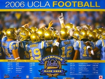
It Has Balance but Not Beauty
UCLA's 2006 poster schedule has balance, is easy on the eyes and earns the seal of approval, but it lacks attention to detail and falls short of several other entries. Now how could this piece have been improved? Our main complaint is with the ugly typeface across the top proclaiming "2006 UCLA Football." It's wasted space and shows a lack of creativity. Something is needed here to punch it up and add pizazz. But hey, you be the judge. What do you think? Compare it to other poster schedules we have displayed: Ohio State, Mississippi State, Auburn, South Carolina, Arkansas, Florida State, Florida, Iowa State and USC. If you have an image or link to your team's 2006 poster schedule, send it our way. The address is dawizofodds (at) aol.com.
Subscribe to:
Post Comments (Atom)
1 comment:
Hey, its got kibble!
Post a Comment